

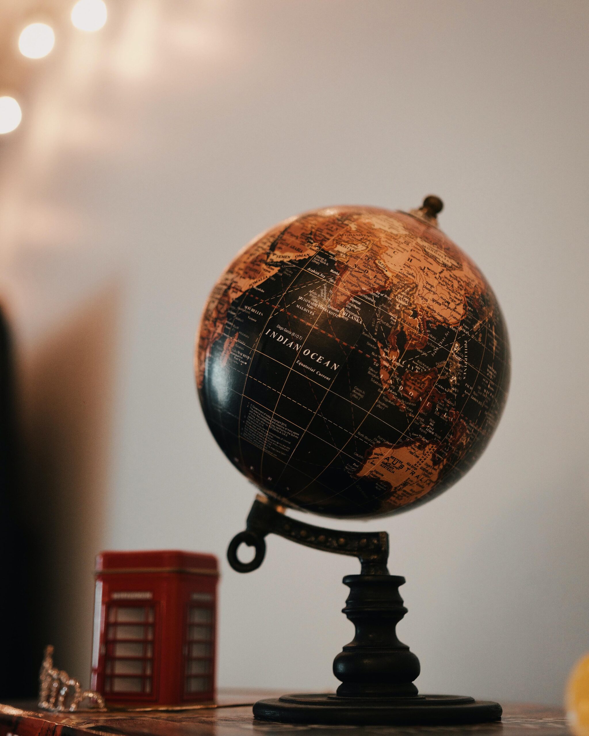
Client: The name of my company is Ntikuma Global Construction Ltd. Please add a globe to my logo to show that it’s an international company. That’s why the name has global.
Me: Oh interesting. What phone do you use?
Client: Samsung
Designer: So the Samsung brand is a global brand right.
Client: Yeah.
Designer: Do they have a globe in their logo?
Client: No.
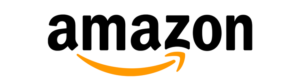
Designer: I’m pretty sure you’ve heard of Amazon.
Client: Of course!
Designer: They’re an international brand too right?
Client: Yeah I do. I get where you’re going with this. Okay then forget about the globe, since it’s a construction company, add a helmet or hammer or some roofing sheet somewhere.
Designer: (Sighs) You said you know Amazon right? What do they do?
Client: It’s an online store.
Designer: Do they have a shopping cart or any element like that in their logo?
Client: Hahaha no please.
Designer: Okay okay what about Nike?
Client: Of course, I know them. They make sport wears.
Designer: Does their logo contain sneakers and any element like that?
Client: Lol no.
Me: A lot of times we get briefs from clients and they give a whole lot of specifications about the kind of elements they’re looking out for in their logos. Because their brand is global, they want a globe in it, because they offer a particular service, they want it in their logo and because they’re photographers, they want a lens in their logo! Logo development goes beyond that. It is a symbol that represents your brand. This doesn’t mean that it should have something to do with exactly what you do as a brand but rather it should identify the business in a way that is recognizable and memorable. It can be formed out of the values you believe in as a brand.
The truth is, it might not be instantly recognizable from the start but as the brand grows and you consistently use the symbol, people will come to relate it with your brand. However, it should be SIMPLE, SCALABLE, VERSATILE AND MEMORABLE.
Let’s do a very short and simple case study with the Amazon logo. The yellow arrow in their logo starts at the letter ‘a’ and ends at the letter ‘z’, implying that they sell everything from a to z. The arrow also represents a smile, with the arrowhead being a stylized dimple or smile line. The smile indicates the happiness people feel when they shop with Amazon.
It’s as simple as that. Next time you go looking for a logo or you’re developing a logo as a designer, take this into consideration. You can also check out the meanings of some famous logos here.
*from my 2017 Archives


Haha great piece there
Lol thank you Seidu!
Wow creative, this is an awesome and inspiring piece of writing
Keep Inspiring us
Thanks Stephen! I’ll do my best!
Light 💡
Insightful. I love this.
Thank you 🙂
Insightful. Great write up
Thanks Duke!
Light 💡
This is inspiring, thanks bro…
woaw this is powerful! client education.